Conversion ·
The Psychology Behind High-Converting Landing Pages
Learn the psychological principles that drive conversions and how to apply them to create better-performing landing pages.
By Abhay Sharma
When someone lands on your page, you have less than a few seconds to make them stay. That moment—where a user decides to scroll, click, or close—isn't just about what you're selling. It's about how the brain reacts to what it sees.
Landing pages aren't just about good design. They're about understanding how people think, what they notice first, and what makes them act. And that's where psychology becomes your best tool—not just as theory, but as a cheat code to make every scroll and click more intentional.
Why Psychology Matters in Landing Pages
People don't read websites. They scan. They react. They leave when something feels "off" and stay when something feels easy. And more often than not, their decision isn't logical—it's instinctive.
The brain uses shortcuts to make decisions quickly. These shortcuts—known as cognitive biases—are what guide (or misguide) attention. A cluttered layout increases cognitive load. A long form adds friction. A familiar logo reduces hesitation.
Understanding what's going on in your visitor's mind—without them realizing it—lets you guide them toward action.
Core Psychological Principles That Drive Conversions
Let's break down a few psychological truths that consistently boost conversions when applied right:
1. Visual Hierarchy
People process visuals faster than text. Most users follow a predictable scanning pattern—usually left to right, top to bottom. That's why your most important message needs to be prominent, fast, and unmissable.
Use clear headers. Use bold subheads. Use white space. Create a clear contrast between the CTA and the rest of the page.
2. Friction Reduction
The fewer decisions a user needs to make, the better. Long forms, jargon-heavy copy, and too many options make people freeze or bounce. Keep forms short. Use plain language. Guide users with one clear CTA at each scroll depth.
3. Social Proof
Nobody wants to be the first to try something. Adding testimonials, recognizable logos, or real customer numbers gives people permission to trust you. The trick? Place your social proof near the CTA, not buried at the bottom.
4. Loss Aversion
People are more motivated to avoid a loss than to gain something new. That's why phrases like "Don't miss out" or "Offer ends soon" work. Scarcity isn't just a tactic—it's a bias. Use it, but use it honestly.
5. Commitment Bias
If someone does something small (like clicking a button or signing up for a free trial), they're more likely to keep going. This is why multi-step forms or small "yes" moments (like checkboxes) help create momentum.
6. Anchoring Effect
When you see a high price first, every lower price seems more reasonable. This is why showing your most expensive plan first can make your mid-tier plan feel like the smart choice.
Blending Psychology with Data
Psychology helps you form better hypotheses. Data helps you test them.
Use tools like heatmaps or scroll depth tracking to see what's getting ignored. Run A/B tests to validate if a shorter form or a red button really changes outcomes.
You're not guessing. You're forming informed assumptions based on how people think—and then watching how they behave. That's where the magic happens.
Practical Takeaways for Better Landing Pages
Here's a quick checklist grounded in behavioral science:
- One CTA per screen/view
- Clear, value-focused headline above the fold
- Add social proof (logos, quotes) close to action buttons
- Use high-contrast, distraction-free CTAs
- Write headlines that are clear > clever
- Reduce form fields to only what's necessary
- Make the next step obvious, always
Visual Summary
Here's a visual breakdown of what a high-converting landing page can look like — based on core psychological principles:
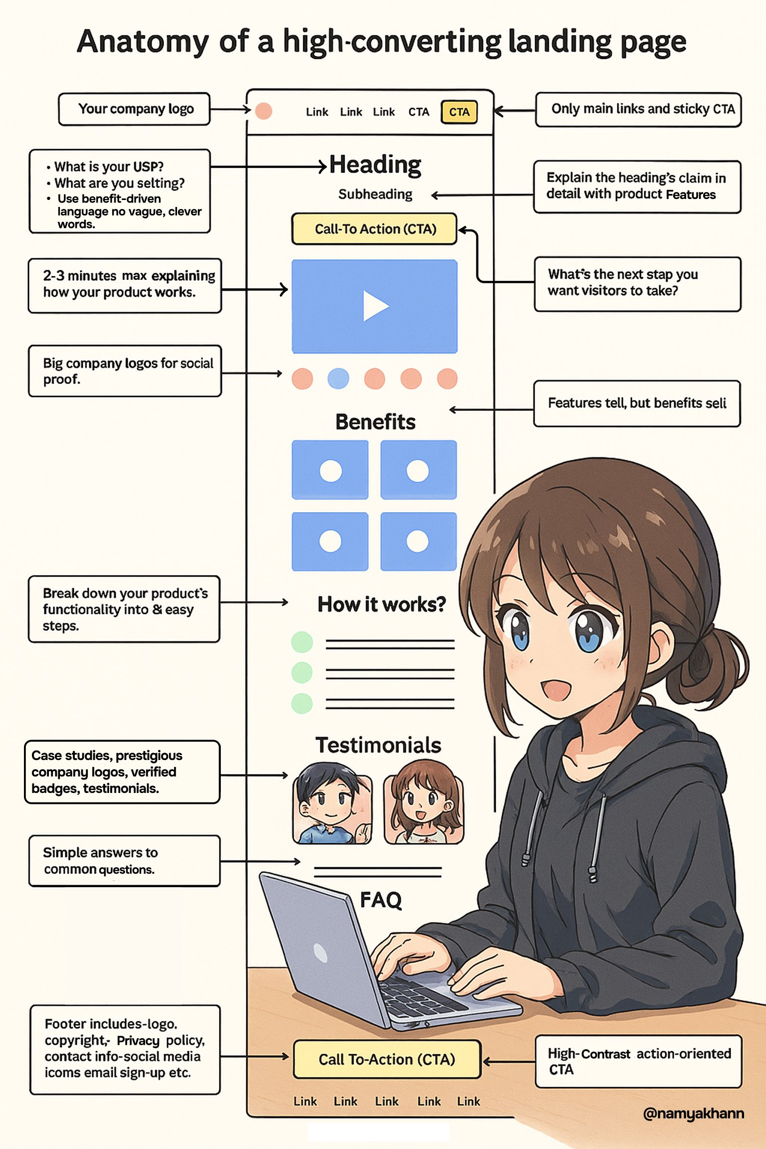
Landing Page Anatomy Breakdown
Top (Hero Section)
- Clear headline showing value (Visual Hierarchy)
- Supporting subtext with benefit (Friction Reduction)
- Strong CTA button with contrasting color
- Trust signals (logos, ratings) to create immediate credibility (Social Proof)
- Optional countdown or urgency tag (Loss Aversion)
Problem/Solution Section
- Framed like a story: what the user struggles with, and how your product solves it
- Use imagery or simple icons to reinforce comprehension (Reduce cognitive load)
Mid-Page CTA
- Repeating the CTA with simpler framing (Commitment Bias)
- Add testimonial or a real quote nearby to build trust (Social Proof)
Product/Feature Highlights
- Visual blocks showing key benefits
- Reinforce the main value prop above the fold
Pricing Table
- Most expensive plan shown first (Anchoring Effect)
- Use highlighting to guide attention to mid-tier plan (The "recommended" one)
- Explain what's included clearly—no small text tricks
FAQ or Objection-Handling Section
- Keep it short and scannable
- Directly answer common hesitations
Final CTA (Footer)
- Repeat the offer with urgency
- Add one last trust-building quote or stat
- Optionally show alternative contact method (for users not ready to convert)
Conclusion
The best landing pages aren't the ones that look the fanciest. They're the ones that feel easy to act on. They meet users where they are—without the user even realizing it.
Build with intention. Design for how people think. And test what works, not just what looks good.